


Hey, SaaS marketer! Are you struggling with product signups? Got a clue where you’re going wrong?
Instead of thinking about it, put your time and effort into changing the same. Chances are higher that you have made a mistake related to the landing page.
We must tell you – you are not alone. Most people think that a SaaS landing page is JUST another web page. This idea leads them to unfavorable outcomes.
Perfect SaaS Landing Page Is All About:
- Clear messaging about your offerings.
- Attractive design that keeps users hooked.
- Compelling copy to entice visitors.
- Crystal clear call to action.
Well, well, well…
Would you like to know the key components of high-converting SaaS landing pages? Here, we will share the Top 10 SaaS landing pages. Hence, you will better understand the secret to creating SaaS landing pages that bring more product signups.
So, let’s begin!
Click Here To Know More: Link Exchange
Table Of Content
1. HubSpot’s Landing Page

HubSpot’s design style is denser but maintains consistent CTAs throughout. The primary CTA stands out in orange.
Support resources like FAQs and a chatbot help visitors learn more about the product. on the other hand, Social proof is showcased through awards and testimonial videos.
Moreover, the highlights are proactive support options, demo videos, product awards and testimonial videos
2. Asana’s Landing Page
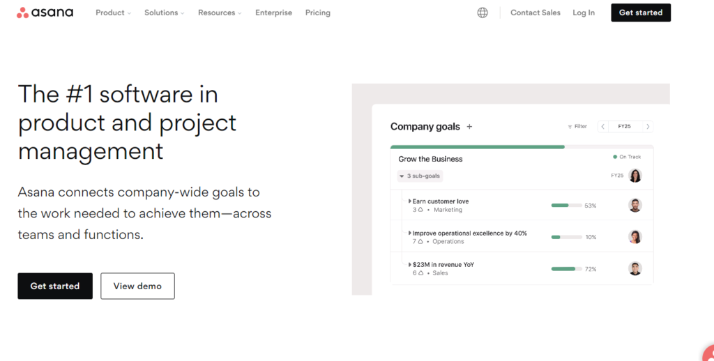
Asana’s project management software utilizes empty space. In fact, it uses a simple color palette in its hero section, which makes the white CTA button prominent.
The page includes product demos to showcase the user experience. Main features are introduced throughout the page with internal links.
Lastly, they make it simple yet effective through a clear CTA, actionable headlines, feature highlights, and further reading options.
3. WeTransfer’s Landing Page

WeTransfer, the Netherlands-based file transfer solution, uses concise copy and a readable font. Clicking the black CTA button takes you to the pricing page.
This comes under those landing pages that feature vibrant visuals and contrasting colors. Hence, it creates a friendly and inspiring atmosphere.
So, what sets them apart? Simple copy, consistent CTAs, visual elements, and email form.
4. Bitly’s Landing Page

Bitly’s landing page has more text than WeTransfer’s but balances it with white space and illustrations to avoid overwhelming visitors.
The primary CTA stands out with a bright color. Company branding and CTA use distinct colors.
Additionally, incorporating highlighted benefits helped to convey what they offer.

In fact, scrolling reveals client brand logos, adding social proof.

5. Userpilot’s Landing Page

Take a peek at our landing page, but we won’t boast too much. It might spark some ideas. The SaaS landing page combines a clear value statement with a short contact form.
Here, Specializations Include:
- Brief and effective text.
- A Central contact form.
- Social proof.
- Humanizing images.
- Personalized user experience.
Also, we request your company size to personalize the demo according to your needs before the call. You’ll notice social proof and team member photos to add a human touch to our design.
6. Airtable’s Landing Page

Airtable creates dedicated SaaS landing pages for each product. This page, focused on Airtable’s interface designer, provides essential information and leads straight to a CTA button.
The hero section’s minimal design efficiently conveys key details and directs attention to the CTA. Below, short sections highlight benefits and display product screenshots to engage prospects.
Additionally, there’s an FAQ section for those who want more information but aren’t ready to reach out .
Here is what you need to know – a clean hero section, emphasized benefits, product screenshots, and self-service FAQs.
7. Mixpanel’s Landing Page

Mixpanel offers product analytics tools that help businesses analyze user behavior within their digital products. It provides insights to improve user engagement and product development.
Highlights: Above-the-fold content (value proposition, social proof, visuals, product demo, call-to-action)
Bonuses: Features and benefits, tailored CTAs for warm and hot traffic, targeted messaging.
8. ADP’s Landing Page

ADP specializes in payroll software and human resource management solutions. Businesses widely use it to handle payroll processing, time tracking, and workforce management.
Highlights: Gradual data collection (firmographic data, email, and more).
Bonuses: Single “Get quote” CTA, chatbot, social proof (trusted by 700,000 small businesses), no exit links.
9. RingCentral’s Landing Page

RingCentral is a provider of cloud-based communication and collaboration solutions. It offers VoIP (Voice over Internet Protocol) services, video conferencing, and business messaging.
Highlights: Social proof (trusted by over 400,000 businesses). Plus, plan comparison tool, call tracking, and live chat support.
10. Typeform’s Landing Page

Typeform offers survey software tools that enable users to create interactive and engaging surveys, forms, and questionnaires. It’s popular for its user-friendly form-building capabilities.
Bonuses: Smooth user experience (no navigation, no footer), free plan offer, features and benefits, ample white space
Final Takeaways – Anatomy Of SaaS Landing Pages
After Analyzing top SaaS landing pages, we observed some common patterns. Now, we are going to break it down and explain it to you in a better way.
So, here you go:
Hero Section
This is the initial impression point. It’s vital to convey your SaaS value proposition succinctly. Use engaging headlines and concise subtext to tell visitors what your product does and why it’s valuable. Avoid making users scroll for essential information.

Features And Benefits
In this section, provide a comprehensive breakdown of what your SaaS offers. Compare each subscription tier’s features and benefits in a detailed comparison table. Potential customers should clearly understand what they get by signing up.

Social Proof
Building trust is crucial. Incorporate social proof elements to reassure visitors of your product’s quality and reliability. This can include customer testimonials, endorsements from notable clients, star ratings, or detailed case studies. Genuine, relatable content here is key.

Contact Form
Some users may have questions or concerns before committing. To capture these leads, place a contact form lower on the page. It should be easily accessible for those who need it. Make sure to ask for the essential information without overwhelming them.

Demo Video
For complex SaaS products, a demo video is a powerful tool. Showcase your product’s capabilities and address pain points visually. Keep the video informative yet concise to maintain user engagement.
Call-to-Action (CTA)
While having multiple CTA buttons can create distractions, one or two well-placed CTAs are necessary. Use compelling language on these buttons, such as “Start Your Free Trial” or “Get Started Now.” Additionally, use FOMO (Fear of Missing Out) elements like countdown timers.

Well, that’s it! Was it helpful?
We at BloggerOutreach help SEOs, brands, and agencies with our premium SEO services. If you want to get improved SEO results, reach out to us!
Would you like to know how we work? Check out our case studies.
Read More: